Toast Kit
Promise-API toasts with auto type switching, a priority queue, undo-actions with a progress timer, grouping, headless mode, and a full design system.
When you'd reach for this
Showing the result of an action without interrupting the user with a modal alert() or hiding it in a console they'll never open — that's where vue-toast-kit starts.
An action's outcome isn't known upfront
A server request can hang, succeed, or fail — instead of manually showing a different notification in every branch of the code, the same notification switches on its own between "loading," "done," and "error."
Deleting something should be reversible
One stray click on "Delete" and the data is gone for good. The notification itself gives you a few seconds to undo, before the action is confirmed for real.
The same event fires dozens of times in a row
Syncing ten files shouldn't mean ten popping cards in a row — one notification with a counter that expands on click covers it instead.
Toasts should look like your product, not a library
The look adapts to any brand without writing a single extra line of styling, and when you need full control, you can drop the visuals entirely and keep just the underlying logic for your own design.
At a glance

Flexible design system and full customisation
Over 30 CSS custom properties (--vtk-*) control colours, fonts, spacing, shadows, and animations. Built‑in light, dark, and system themes, plus the ability to pass a token object directly to the ToastContainer theme prop. This lets you adapt toast appearance to any brand without overriding styles or using !important.

Positioning, animations, and stack mode
Six preset positions (top/bottom + left/center/right) with smooth CSS enter/exit animations (slide + fade) for each position. Stack mode (Sonner‑style) visually collapses multiple toasts into a stack, showing up to two ghost cards behind the active one, which expand on hover. Supports prefers‑reduced‑motion.

Grouping, icons, slots, and touch interaction
Toasts with the same groupKey collapse into one with a +N counter that expands on click. Built‑in icons for each type (replaceable with a custom component or emoji). Full override via slots: from the entire toast to individual parts — icon, content, buttons, and progress bar. Supports swipe‑to‑dismiss on touch devices and RTL layout.

Promise API with auto‑switching and Undo with progress
toast.promise() automatically switches a toast from loading to success or error, returning the original promise for await. toast.undo() creates a toast with an animated progress bar and undo button: clicking the button calls onUndo and closes the toast; timer expiry confirms the action via onAutoClose. Async callbacks are supported.

Priority queue, isolated contexts, and SSR
Four priority levels (critical, high, normal, low) control the queue: high‑priority toasts preempt low‑priority ones when the visible limit is reached. createToastContext() creates isolated queues for micro‑frontends or separate notification zones. The core is SSR‑safe: toasts fired on the server are buffered and replayed after ToastContainer mounts.
Headless mode and accessibility
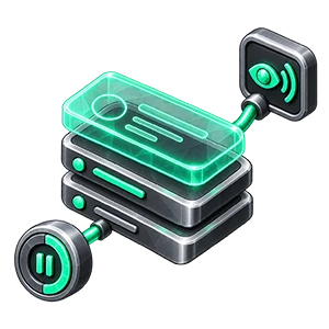
useToastState() exposes the entire queue, timers, and toast state with zero built‑in markup — build your own UI when the bundled design system doesn’t fit. Every toast gets the correct ARIA role and aria-live attribute, and its auto‑dismiss timer pauses on hover, focus loss, and background tabs.
See how it works
One call, three toast states
toast.promise flips the toast from loading to success or error based on the promise's outcome, and returns that same promise so await keeps working as usual.
import { toast } from 'vue-toast-kit'

await toast.promise(
  fetch('/api/deploy').then((r) => r.json()),
  {
    loading: 'Deploying…',
    success: 'Deployed successfully!',
    error: 'Deployment failed',
  },
)

// One call, three states — the toast flips from loading to success/error
// on its own, and the original promise is still returned so you can await it.
Deletion with a real window to undo, not instant
toast.undo shows a countdown progress bar — the actual delete (permanentlyDelete) only happens once time runs out and the user hasn't clicked Restore.
import { toast } from 'vue-toast-kit'

function deleteFile(id: string) {
  markForDeletion(id)

  toast.undo(`File "${fileName}" deleted`, {
    undo: {
      label: 'Restore',
      duration: 6000,
      onUndo: () => {
        restoreFile(id)
        toast.success('File restored')
      },
    },
    onAutoClose: () => permanentlyDelete(id),
  })
}

// A countdown progress bar gives the user a real window to change their
// mind — the delete only actually happens once the timer runs out unanswered.
Similar toasts collapse into one
Toasts sharing a groupKey collapse into a single one with a "+N" counter — dismiss the leader and the next one takes its place automatically, so the screen doesn't fill up with near-identical notifications.
import { toast } from 'vue-toast-kit'

// All three calls produce one visible toast, with a "+2" counter
toast.info('New message from Alice', { groupKey: 'messages' })
toast.info('New message from Bob', { groupKey: 'messages' })
toast.info('New message from Carol', { groupKey: 'messages' })

// The leader (first in the group) stays visible; when it's dismissed, the
// next toast in the group takes over automatically.